- Z-Image is built specifically for photorealism — it rewards specificity and penalizes vague prompts, responding to lighting direction, material descriptions, and photographic terminology rather than generic adjectives.
- Every effective prompt follows four parts: subject and context, lighting and time of day, camera and composition, and film stock or color grade — four focused sentences that give the model everything it needs.
- Iterate on single elements rather than rewriting entire prompts — if a generation is 80% right, adjust one variable (lens compression, lighting direction, grain structure) and regenerate rather than starting over.
What Makes Z-Image Different
Z-Image is built for one thing: photorealism. It’s not designed for illustration, concept art, or stylized output. It’s designed to make you believe you’re looking at a photograph. That precision comes with expectations. The model rewards specificity. It responds to lighting direction, material descriptions, and photographic terminology. It penalizes vagueness.
This is why generic prompts fail with Z-Image. The model wants to be specific. It’s designed for it. When you’re vague, you’re working against the model’s strengths.
The Four-Part Prompt Structure for Z-Image
Every effective Z-Image prompt has a structure. Not a rigid formula, but a logical flow that lets the model understand your intent at every level. Here’s the structure that works:
Part 1: Subject + Context (1-2 sentences)
What’s in the image? Be specific about who, what, or where. Not “a person” but “a woman in her 40s wearing a linen blazer.” Not “an office” but “a minimalist startup workspace with floor-to-ceiling windows overlooking the city.”
Part 2: Lighting + Time of Day (1 sentence)
How is this scene lit? What time of day? What’s the light quality? This is where you establish mood. “Shot during golden hour with warm side lighting” is infinitely better than “nice lighting.”
Part 3: Camera + Composition (1 sentence)
What’s the camera setup? What’s the framing? What lens? What’s the depth of field? “Shot on a 35mm lens with shallow depth of field, close-up of the subject’s face” tells Z-Image exactly what to render.
Part 4: Film Stock + Color Grade (1 sentence, optional but powerful)
What’s the aesthetic? This can be a film stock reference, a photographic style, or a color temperature direction. “Shot on Kodak Portra 400 with warm color grading and soft contrast” anchors the look.
That’s it. Four sentences. Not 20. Not 100. Four focused sentences that cover subject, light, camera, and aesthetic. Z-Image does the rest.
Z-Image Prompt Examples
These are actual prompts that work with Z-Image. They’re not abstract. They’re not theoretical. You can paste them into LTX Studio right now and modify them for your use case.
Portrait Photography
Example 1: Professional Headshot
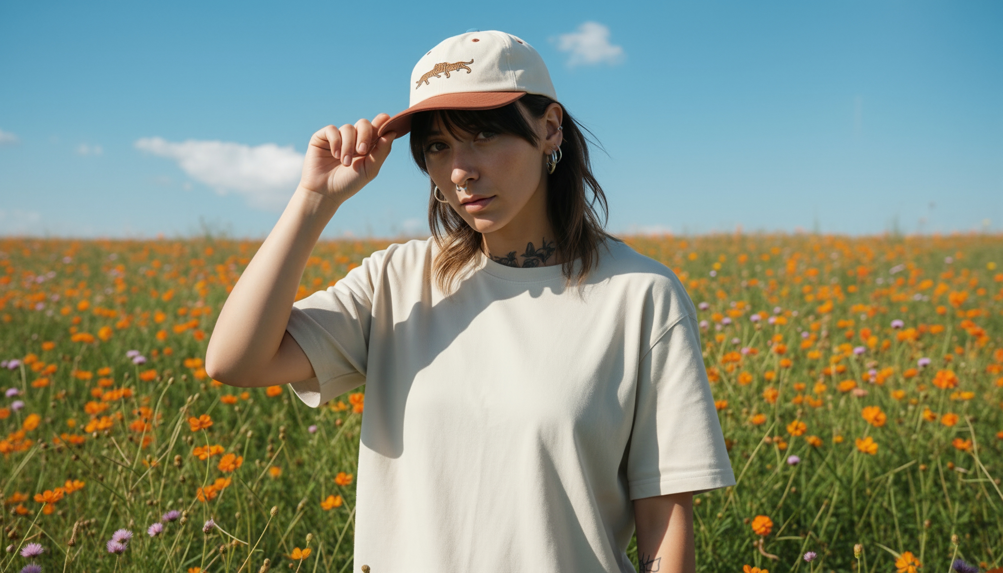
A professional woman in her 30s with dark hair, wearing a charcoal gray blazer and subtle gold jewelry, looking directly at the camera with a confident expression. Shot during soft studio lighting with a key light from the left and subtle fill light. Shot on an 85mm portrait lens with shallow depth of field, close framing of the face and shoulders. Shot on Kodak Portra 400 with warm, neutral color grading and soft shadows.
Why this works: It specifies age, clothing, expression, and jewelry. The lighting is directional. The lens choice creates the expected depth of field for a portrait. The film stock anchors the color and contrast.
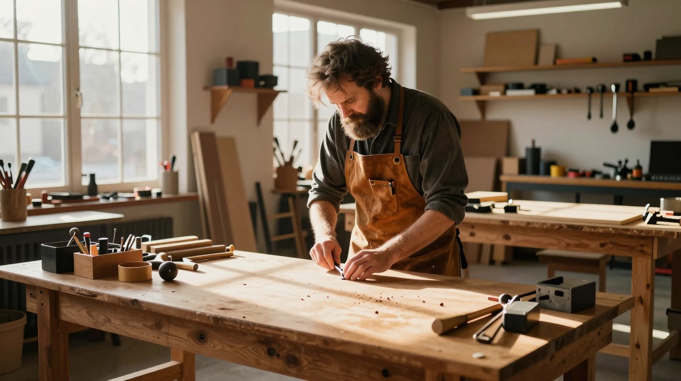
Example 2: Environmental Portrait
A bearded man in his 50s, wearing a vintage leather apron, working at a wooden workbench in a sunlit craftsman studio. Soft natural light streams through large windows, creating long shadows across the workspace. Shot on a 50mm lens with medium depth of field, wide shot framing the man and his environment. Shot on Fujifilm Superia with warm color grading and rich shadow detail.
Why this works: It establishes context and activity. The lighting is natural and directional. The composition is wide enough to show the environment. The film stock suggests color warmth and mid-tone richness.
Product Photography
Example 1: Luxury Watch
A stainless steel luxury sports watch with a black dial and blue hands, displayed on a polished black marble surface. Directional lighting from above and to the left, creating sharp highlights on the metal case and bracelet. Shot on a macro lens with extreme close-up framing of the watch face and case side. Shot on a medium format camera with neutral, bright color grading and high contrast.
Why this works: Product photography requires material specificity. The marble establishes luxury context. The lighting is directional enough to show metalwork. The macro lens and close framing emphasize detail. The format and grading suggest premium product photography.

Example 2: Lifestyle Product Shot
A white ceramic coffee mug filled with dark espresso, placed on a light wood table next to a croissant and fresh flowers in a simple glass vase. Soft natural light from a window to the left, creating warm highlights and soft shadows. Shot on a 50mm lens with medium depth of field, flat lay angle from directly above. Shot on Fujifilm Pro 400H with warm, inviting color grading and soft highlights.
Why this works: Lifestyle product photography includes context. The wood table and flowers establish a morning scene. The overhead angle is typical for this style. Natural light is specified. The film stock suggests warmth and approachability.
Architectural Photography
Example 1: Modern Interior
A minimalist bedroom with white walls, a low platform bed with linen bedding, and a single sculptural pendant light hanging above a side table. Natural light floods through large floor-to-ceiling windows, creating geometric shadows on the wall. Shot on a 24mm wide-angle lens with deep depth of field, shot from the foot of the bed looking toward the window. Shot on digital medium format with cool, neutral color grading and precise exposure.
Why this works: Architecture needs wide framing. The wide-angle lens shows the space. Deep depth of field keeps everything sharp. Modern spaces work with cool, neutral grading. The digital format is appropriate for architectural precision.
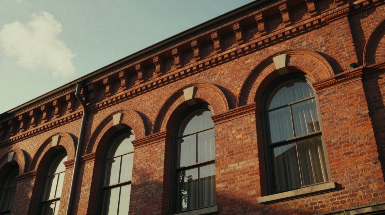
Example 2: Historic Building
A 19th-century brick building facade with detailed cornices and large arched windows, shot during golden hour. Warm side lighting rakes across the brick, emphasizing texture and architectural detail. Shot on a 35mm lens with medium depth of field, low angle shot looking up at the building’s upper levels. Shot on Kodak Portra 400 with warm color grading, slight fade, and lifted blacks for vintage feel.
Why this works: Historic architecture benefits from warm, directional light. The low angle emphasizes the building’s scale. The lens choice is standard for architectural work. The film stock and grading suggest documentary photography of heritage buildings.
Food Photography
Example 1: Plated Dish
A plated restaurant dish featuring pan-seared duck breast, microgreens, and a rich sauce on a white ceramic plate. Soft studio lighting from the left with subtle reflector fill, creating definition without harsh shadows. Shot on a 100mm macro lens with shallow depth of field, angled shot from the top-left showing the plate and food arrangement. Shot on Kodak Portra 400 with neutral, slightly cool color grading and careful highlight retention.
Why this works: Food photography is about details and lighting control. The macro lens shows texture and plating. Studio lighting is standard. The angle shows both the food and the plate. The film stock is food photography standard.
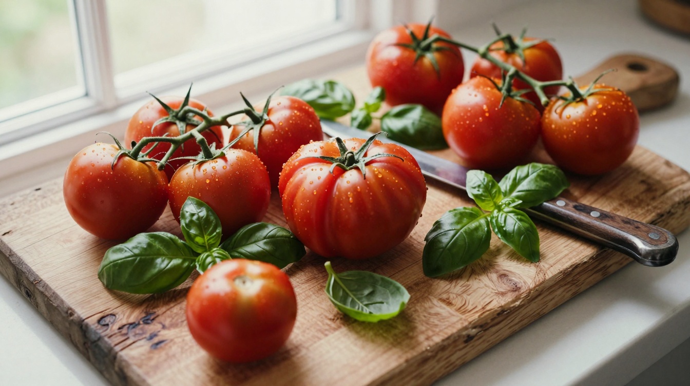
Example 2: Ingredient Shot
Fresh organic tomatoes on the vine, scattered across a worn wooden cutting board with scattered basil leaves and a vintage knife. Bright natural light from a window, creating soft shadows and highlighting the tomato skin texture. Shot on a 50mm lens with shallow depth of field, flat lay composition with slight tilt. Shot on Fujifilm Superia with warm, vibrant color grading and natural film grain.
Why this works: Ingredient photography needs texture and warmth. Natural light is appropriate. The macro elements (basil, knife) add interest. The film stock suggests fresh, natural food styling.
Common Mistakes and How to Fix Them
Even with structure, prompts fail. Here’s why, and how to fix it:
Mistake 1: Being Too Vague About Lighting
Bad: “A woman standing outside. Nice lighting.”
Better: “A woman standing in a park during golden hour with warm side lighting and long shadows cast to the right.”
Z-Image needs direction. “Nice” is worthless. “Golden hour” is instruction.
Mistake 2: Skipping Camera Language
Bad: “A close-up of a watch.”
Better: “A close-up of a watch shot on a macro lens with extreme shallow depth of field, emphasizing the dial and case.”
Camera language tells the model what depth of field, perspective distortion, and framing to apply. Without it, you lose control.
Mistake 3: Mixing Aesthetics
Bad: “A luxury product shot in the style of a documentary photograph.”
Better: “A luxury watch shot on a macro lens with studio lighting, shot on medium format film stock with bright, precise color grading.”
Contradictory aesthetics confuse the model. Luxury and documentary are different visual languages. Pick one and commit.
Mistake 4: Overloading with Adjectives
Bad: “A beautiful, gorgeous, stunning, amazing woman in an incredible setting with spectacular lighting.”
Better: “A woman with striking features, wearing a tailored suit, shot in studio lighting with shallow depth of field.”
Z-Image doesn’t need cheerleading. It needs specifics. “Striking” is better than “gorgeous” because it describes visible characteristics. “Tailored suit” beats “incredible clothing.”
Mistake 5: Assuming Default Behavior
Bad: “A landscape. Default lighting and angle.”
Better: “A mountain landscape at sunrise with warm golden light, shot on a wide-angle lens, shot on Fujifilm Pro 400H film stock with cool shadow detail and warm highlights.”
There is no default. You have to specify. Every prompt needs lighting, camera, and aesthetic direction.
Workflow: From Concept to Final Prompt
Here’s how to approach Z-Image prompting in practice within LTX Studio:
Step 1: Define Your Subject in Specific Terms
Don’t start with “a person.” Start with age, clothing, activity, expression. “A man in his 40s wearing a denim jacket, leaning against a brick wall, looking pensively to the left.” That’s specific. That’s generative.
Step 2: Choose Your Lighting Scenario
Will this be golden hour? Studio light? Natural window light? Night photography? Pick one. Write one sentence about it. “Shot during golden hour with warm side lighting from a low angle.”
Step 3: Select Camera Language
What lens? What framing? What depth of field? “Shot on a 50mm lens with medium depth of field, waist-up composition.” That’s one sentence. That’s control.
Step 4: Pick Film Stock or Color Grading Direction
This is optional but powerful. “Shot on Kodak Portra 400 with warm, slightly faded color grading.” Now your aesthetic is locked.
Step 5: Enter Into LTX Studio’s Image Generation Space
In LTX Studio, navigate to the image generation workspace. Paste your prompt. Click generate. Z-Image will return 6 variations. Look at them. If they’re close but not perfect, modify one element. “More saturated color” or “harder lighting” or “wider framing.” Regenerate.
Step 6: Iterate on Details, Not Fundamentals
If the first generation is 80% there, don’t rewrite the whole prompt. Say: “Same image but with a telephoto lens compression creating a tighter background.” Z-Image responds well to incremental direction.
Advanced Techniques: Getting Professional Results
Technique 1: Use Aperture Values to Specify Depth of Field Precision
Instead of “shallow depth of field,” try “shot on an 85mm lens at f/2.8.” Z-Image understands aperture values. This gives you precise control over how much background blur you get.
Technique 2: Reference Real Photographers or Publications
Z-Image responds well to references. “In the style of Annie Leibovitz” or “shot like a Vogue cover” gives the model a visual target. It’s more effective than trying to describe aesthetics abstractly.
Technique 3: Specify Film Grain Behavior
Film stocks have different grain structures. “Shot on Kodak Tri-X with pronounced grain” produces very different results from “shot on Fujifilm Pro 400H with fine grain.” Use this to control visual texture.
Technique 4: Layer Material Descriptions for Texture Detail
Instead of “a leather bag,” try “a worn caramel leather bag with visible creases and a patina finish.” The more specific you are about material age and condition, the more texture detail you get.
Technique 5: Use Negative Prompting (What NOT to Generate)
Z-Image’s interface in LTX Studio lets you specify what not to generate. Use it. If you don’t want blurred backgrounds, specify “sharp throughout.” If you don’t want skin retouching, specify “natural skin texture.” This removes entire classes of undesired variation.
Quick Reference: Prompt Templates You Can Modify
Portrait Template:
“[Age and description], wearing [clothing], [pose/expression]. [Lighting direction and time]. Shot on [lens] with [depth of field]. Shot on [film stock] with [color grading].”
Example: “A woman in her 30s with short blonde hair, wearing a cream linen shirt, leaning against a window. Shot during soft golden hour with warm window light. Shot on a 50mm lens with shallow depth of field. Shot on Kodak Portra 400 with warm, natural color grading.”
Product Template:
“[Product name/description], [placement/context], [specific material details]. [Lighting type and direction]. Shot on [macro or telephoto], [framing]. Shot on [film stock] with [color treatment].”
Example: “A ceramic espresso cup filled with dark espresso, placed on a marble countertop next to a fresh croissant. Soft studio side lighting. Shot on a 100mm macro lens with shallow depth of field. Shot on Fujifilm Superia with warm, slightly saturated color grading.”
Environmental Template:
“[Subject] in a [environment], [activity/context]. [Lighting and time of day]. Shot on [wide angle lens], [composition]. Shot on [film stock] with [aesthetic direction].”
Example: “A craftsman working at a wooden workbench in a sunlit workshop, surrounded by tools and half-finished pieces. Shot during afternoon natural light with warm window rays. Shot on a 35mm lens with medium depth of field, wide composition. Shot on Kodak Portra 400 with warm, rich color grading.”
Next Steps: Using Z-Image Outputs in Your Workflow
Once you’ve generated a Z-Image photo you’re happy with, you can use it as a keyframe for video in LTX Studio. Use a strong Z-Image output as your opening frame, then animate it with LTX-2.3 or another video model. The consistency of Z-Image means your video will maintain that photorealistic aesthetic throughout.
Z-Image is one of four image generation models available in LTX Studio. FLUX.2 Pro balances quality and speed. Nano Banana Pro and Nano Banana 2 excel at illustration and stylization. Z-Image is your choice when photorealism is non-negotiable. Learn which tool to reach for, and your output quality will jump.
The best prompts aren’t the longest. They’re the most specific. Four sentences. Subject. Light. Camera. Aesthetic. That’s the pattern that works. Use it. Modify it. Iterate on it. This is how you extract professional results from Z-Image.


Maximize your creative potential with AI-powered tools
Maximize your creative potential with AI-powered tools


.png)